Am I Made of Glass?

Sunday, August 1, 2010
One more post, I promise.  I screwed up on this one, but I'm posting it anyways because I worked really hard on it and it means a lot to me.  The title "am i made of glass?" is after the Trapt song "made of glass".  the follow up line is "'cause you see right through me".  This is a tribute to my love Charles, because it is oh so true.  He can see right though me.  I suppose it's because we endured a long distance relationship for over 2 years.  He lived in Dallas, TX while I lived in Fargo, ND.  We got to know each other sooo well because all we had was the telephone and skype.  We saw each other every 3 months.  One stretch was 5 months, and a couple of times there was a only a couple of week between visits.  It was a very challenging time in my life.  Because we talked ALL the time, he knew what was up with me just by the tone of my voice, and still does. 


Where do I even begin with this one?  I used so many different products and techniques.  I'll start with the background.  I used an 81/2 x 11 transparency and stamped on it using some of my favorite stamps.  After all the stamped images dried I used Tim Holtz alcohol inks to add various colors of greens/blues.  The smaller photo you see of Charles and I is altered using Tim Holtz Fragments (it's a piece of acrylic for those unfamiliar) and then used alcohol ink on it to give it an old warn look and then glued the photo to the fragment using glossy accents.  For the title, I cut it out with my quickutz hand cutting tool and then used Stickles (glitter glue) on top of it to give it some color and blingy dimension.  

Tools Used:
Various Stamps
Quickutz

Supplies Used:
Various Tim Holtz Alcohol Inks
Tim Holtz Gear parts
Tim Holtz Lock and Key
Tim Holtz Fragments
Tim Holtz Game Spinner
Ranger Glossy Accents
Ranger Archival Ink
Ranger Stickles Turquoise
Prima Flowers
Prima Leaf
Michaels brand butterfly

Twilight-A Mother/Daughter Obsession

This layout is a tribute to the love my daughter and I have for the Twilight Saga.  She's pretty young, so she hasn't read the books yet.  I've read the books (on my 2nd time through) and absolutely love them.  Next up is to read them with my daughter.  We took this photo the day Megan and I went to see New Moon on opening day.  This is now framed and in my daughter's "twilight" room.    


Close up of the title, etc.  The "Cullen" charms came from a bracelet of Megan's that broke.  Viola-perfect scrapbook accent!  I found the Twilight font online somewhere.  I found the book cover images on photobucket.com and printed them out.  


Tools Used:
Martha Stewart Border Punch

Supplies Used:
Flocked Patterned Paper by DCWV
Bazzill Card Stock
Black Ribbon


The Color Room-Palette #12

As I become fluffier by the day, it becomes more challenging for me to muster the creative energy to scrap.  And if I do find the energy to scrap, there is nothing left over for the drawn out process of posting this stuff on my blog or any other site.  This particular palette felt sophisticated and classy.  


This layout features my love, Charles.  I love this photo of him that he took of himself with his iPhone.
Charles really is a classy guy.  Aside from his rocker style he wears when he's going casual, when he dresses otherwise, he dresses to the 9's.  He's all up on his fashion and has great taste.  He is the one who decorated the inside of our home.  The outcome of that will be featured in another layout.  For now, here is my take on the palette.  

(click on picture for larger image)
Tools Used:
Cricut (the word "style" and corner black flourishes)
Cricut Gypsy (the word "style" and corner black flourishes)
Quickutz Revolution (the word "class"
Sheet music stamp by Tim Holtz & Stampers Anonymous
Tim Holtz paper distressor
Dymo Label Maker (the words "is what you have")


Supplies Used:
Bazzill Cardstock
Patterned Paper from My Minds Eye (orange flourish that I cut out from the paper)
Grunge board by Tim Holtz (big charcoal flourishes)
Tim Holtz Distress Ink in Black Soot (used on big grunge board flourish and to distress the the paper)
Tim Holtz Ideaology Metal Corner
Tattered Angels Glimmer Mist in Graphite and Pearl
Staz On Ink Pad
Transparency and chipboard from my stash

Notes about this layout:
I've been making a lot of my own transparencies lately (sheet music on this layout).  I have a whole lot of blank transparency sheets thanks to a friend.  What I do is stamp my image onto the transparency sheet with my favorite stamps and Staz On Ink, and then once it dries, cutting it out and applying it with clear glue.  I like Scotch's wrinkle free glue.  Very cost effective technique since you can get quite a few cuts from one transparency sheet!  


Pure Bliss-Scrap That! June Kit

Wednesday, June 16, 2010
I created this layout using the goodies in the June Scrap That! kit.  Soooo fun!  Once a month I get shipment full of coordinating papers, embellishments and goodiess.  It makes putting pages together a snap!  


I did do a little pen work on this layout-the dots all around.  I also stamped and cut my own leaves that are along the side the photo.  The butterflies I used a Martha Stewart punch and the bling is from my stash.  Everything else came in the kit.  The photo is of Megan and Tristen a few years back.  They were so tiny it seems and swinging was so fun to them.  I remember them giggling and laughing with every whoosh through the air.  


The journaling reads:  May you always remember to enjoy life's simple pleasures.  That which cannot be bought in a store or taken from you.


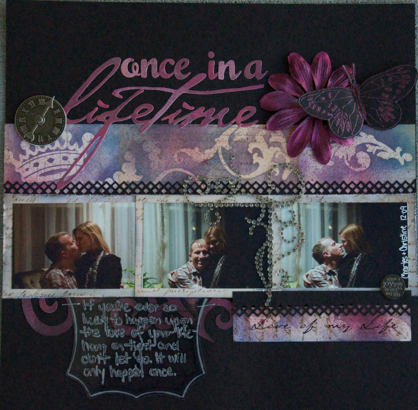
Once In a Lifetime

This layout is featuring my love Charles and I.  Words and even art, I feel, can't even describe how much this man means to me and what a change, for the better, he's been in my life.  What he and I share is truly extraordinary to anything I've experienced in my life.  In a few short months, it will be 3 years since this adventure began.  We've had our ups and downs-but mostly ups.  My soul runneth over with joy when I'm with him and this layout describes how I feel about our relationship. The photos are from the most romantic week of my life when I was down in Dallas visiting my sweetheart-just weeks before he would  move here to Fargo to be with me after 2.5 years of a long distance relationship.  His mom took these photos while we were visiting the family for Christmas.  

The journaling reads:  If you're ever so lucky to happen upon the love of your life, hang on tight and don't let go.  It will only happen once.  
(click on photo for larger image)

I started with a cream piece of patterned papers and used Tim Holtz masks for the crown and flourishes before going over the mask with 3 different color inks to design my own custom patterned/colored paper.  I then spritzed over the top of that with the black cherry glimmer mist, giving it a shimmery shine.  The butterfly is stamped on a black piece of card stock with clear embossing ink then heat embossed using a shimmery metal embossing power.  

Tools Used:
Quickutz Revolution for title
Washington Font
Cricut and Cricut Gypsy for flourish
Martha Stewart punch for border
Martha Stewart stamp (butterfly)
Tim Holtz masks (crown & flourish)


Supplies Used:
Patterned Paper
Black Card Stock 
Prima flower
Tim Holtz metal clock
Tim Holtz Distress Ink in Broken China, Dusty Concord and Chipped Sapphire
Tattered Angels Glimmer Mist in Black Cherry
Me and My Big Ideas transparency for journaling
Clear sticker by DCWV

Thanks for stopping by!  
Christine

The Color Room-Palette #10

When I saw this week's color palette, I knew right away which photos I would use for the challenge.  


This week's layout is featuring Megan and Tristen at the beach at Buffalo State Park last summer.  We love going there in the summer because it only takes about 20-30 minutes to get there, and the swimming beach is fabulous!  I lounge in my lounge chair and scope out scrapping magazines while snapping photos here and there.  So relaxing. No patterned paper on this layout-just colored card stock.  That's it.  Pretty basic, nothing spectacular, but it took me forever to figure out what I was doing.  Sorry for the bad photo.

(click on photo for larger image)


Tools Used:
Quickutz Revolution for title and flourish
Beauty Queen font for title
Cricut and Cricut Gypsy for title. lounge chairs, sun and umbrella.
Tim Holtz Stamps (on umbrella)
EK Success punch (circles)


Supplies Used:
Card Stock 
Tim Holtz Distress Ink in Pumice Stone 
Tattered Angels Glimmer Mist in Lemon Zest used on sun and umbrella
Me and My Big Ideas bling (on flourishes-they are red and can barely see them and in title)


Thanks for stopping by!  
Christine

The Color Room-Palette #9

Wednesday, June 9, 2010
This week's palette was another challenging one for me, but I must say, I really like the end result of this project.  I just had a hard time fathoming red with a baby blue and light pink.  Weird, right?!  


This layout features a photo of Megan and I from 2007.  I choose to title "Sugar and Spice" for two reasons.  The color pink represents sugar and the color red represent spice, and I'm using this idea to describe her personality.  Some times spicy and sometimes sweet.  :D  

Tools Used:
Quickutz Revolution for title
Beauty Queen font for tittle
Cricut and Cricut Gypsy for large shapes and vines/leaves
Tim Holtz Stamps (birds)
Fancy Pants Stamps (corner doodling)

Supplies Used:
3 different patterned papers in pink, light blue and deep red.
White Card Stock 
BasicGrey doilies (black strip across bottom)
Tim Holtz Grunge Board (hearts)
Tim Holtz crackle paint in Brick Red (hearts)
Tim Holtz Distress stickles in Brick Red (hearts)
Tim Holtz Distress Ink in Pumice Stone (used on the edges of the large shapes to give them depth)
Prima Say it in Gems (dragon fly)
Michaels brand flowers

Thanks for stopping by!  
Christine


Get a playlist! Standalone player Get Ringtones

Total Pageviews